Brand deck

The operating manual behind Ron Boyton and The Heritage Lens.

This page acts as the internal reference for identity, typography, colour, tone, spacing, photographic direction, and applied brand behaviour across digital and print surfaces.

Heritage Lens is designed as a quiet editorial photography brand with enough structure to guide future decisions without draining the work of personality. It sits between authorship, interiors relevance, and slower enquiry-led buying. The brand should therefore feel composed, warm, exacting, and calm.

Interior mood study showing how Heritage Lens work sits within a room

Brand principle

Place before promotion

The brand should always feel rooted in atmosphere, land, architecture, weathering, and memory. Heritage Lens is not designed to behave like an aggressive ecommerce gallery. It should frame photography as something lived with over time.

Brand principle

Quiet usefulness to interiors

The visual system must help homeowners, collectors, and designers judge how a work will actually sit in a room. Calm proportion, material compatibility, and wall presence matter as much as artistic authorship.

Brand principle

Editorial restraint

Spacing, typography, motion, and copy should all feel measured. The site can be elegant and premium without becoming glossy, loud, or over-designed.

Brand principle

Author and imprint in balance

Ron Boyton remains the authorial name. Heritage Lens functions as the framing identity and quality system around the practice. Neither should cancel the other out.

01 Opening narrative

Heritage Lens frames Ron Boyton’s work as a lasting photographic practice for considered spaces.

The brand exists to present photography in a way that feels collected rather than merchandised. Its role is to create coherence around authorship, archive discovery, placement guidance, and quieter commercial confidence. The site should help someone imagine how a work lives on a wall over years, not how fast it can be added to a cart.

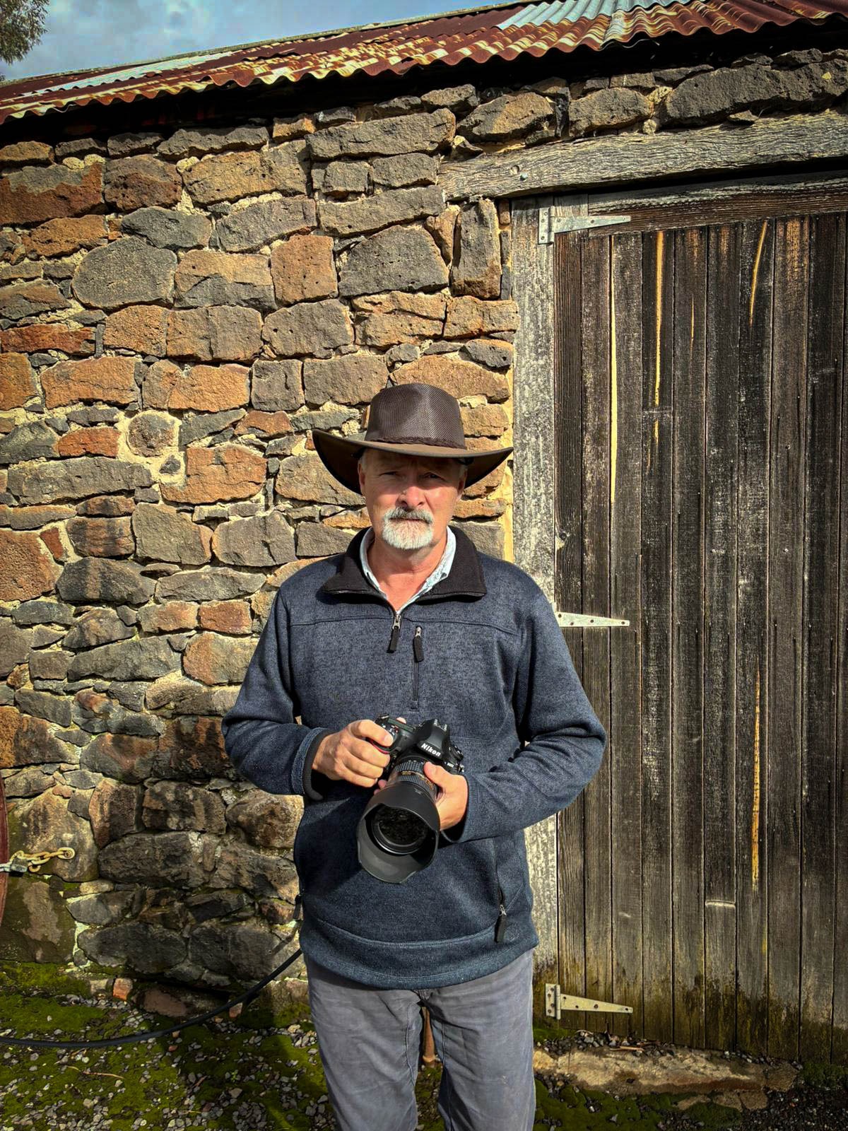
Ron Boyton is the authorial presence. Heritage Lens is the imprint, lens, and system through which the work is edited, framed, and presented. Together they form a brand that speaks to collectors, designers, homeowners, and project clients who value atmosphere, material sympathy, and visual restraint.

Brand thesis

  1. 1. The work must feel place-led, not trend-led.
  2. 2. The interface must support judgement and enquiry rather than force urgency.
  3. 3. The brand should remain warm, editorial, and interiors-aware in every medium.

02 Identity architecture

How Ron Boyton and The Heritage Lens should appear together.

The brand system should preserve a clear distinction between the photographer and the framing identity. Ron Boyton is the personal authorship layer. The Heritage Lens is the branded context that gives the practice its editorial coherence, room-facing usefulness, and premium recognisability.

Preferred expression

Ron Boyton

The Heritage Lens

Keep the relationship quiet and architectural. The mark should read as a composed nameplate, not a badge, crest, or decorative logo stamp.

RuleStandard
Primary lockupUse the stacked relationship with Ron Boyton as the name line and The Heritage Lens as the imprint line. The lockup should feel vertically composed, not compressed into a banner-like strip.
Lead hierarchyOn brand-led pages, Heritage Lens can lead conceptually, but the visible lockup should preserve Ron Boyton clearly. On biography and authorship-led moments, Ron Boyton may lead in copy while the brand remains the framing system.
Clear spacePreserve at least the height of the word Lens around the full lockup on all sides. No rule, button, image edge, or navigation divider should enter that field.
Minimum sizeFor digital use, avoid rendering the full stacked lockup below 148 px wide. Below that threshold, simplify surrounding context rather than compressing the mark.
AlignmentKeep the lockup left aligned in editorial layouts. Avoid centering it in crowded navigation zones unless the entire composition is deliberately symmetrical.
MisuseDo not outline the mark, add heavy drop shadows, stretch letterforms, place it over noisy images without tonal control, or flatten it into a long cramped navigation strip.

03 Colour system

A restrained warm palette designed for paper, plaster, timber, and shadow.

The palette should never read as fashionable colour for its own sake. Its job is to support photographic work, echo natural materials, and create a soft but premium editorial field. Bright primaries, hard luxury black-and-gold clichés, and sterile white-ground ecommerce neutrals fall outside this system.

Primary accent

Walnut Copper

Hex: #8E5834

RGB: 142, 88, 52

CMYK: 0, 38, 63, 44

Primary buttons, emphasis rules, small highlights, selective brand accents, and warmth anchors across interface moments.

Primary dark

Deep Umber

Hex: #4A3325

RGB: 74, 51, 37

CMYK: 0, 31, 50, 71

Primary body text, deep contrast areas, business card reverse, footer dark moments, and editorial grounding.

Primary light

Parchment

Hex: #F7F0E7

RGB: 247, 240, 231

CMYK: 0, 3, 6, 3

Main page grounds, soft card fills, light paper simulations, and reading surfaces that should feel warm rather than stark white.

Secondary neutral

Stone Wash

Hex: #EDE2D4

RGB: 237, 226, 212

CMYK: 0, 5, 11, 7

Panels, layered sections, hover fields, mock stationery grounds, and subtle separation of content blocks.

Secondary warm neutral

Weathered Sand

Hex: #D8C5AE

RGB: 216, 197, 174

CMYK: 0, 9, 19, 15

Supportive lines, light framing, understated chips, and low-contrast secondary surfaces.

Dark support

Charred Bark

Hex: #2B1C15

RGB: 43, 28, 21

CMYK: 0, 35, 51, 83

Dark-panel backgrounds, reverse business card application, and low-key image-adjacent text fields.

Usage ratioGuidanceAvoid
60 to 70% light groundsUse parchment and stone-based neutrals for the majority of reading surfaces and calm spatial continuity.Avoid pure white dominance across long pages.
20 to 30% dark groundingUse deep umber and charred bark for contrast zones, reverse cards, footer depth, and typographic anchoring.Avoid black blocks that feel detached from the rest of the warmth scale.
Under 10% accentUse walnut copper sparingly for call-to-action hierarchy, dividers, and selective emphasis.Avoid turning the accent into a dominant brand wash or decorative gradient.

04 Typography system

Editorial hierarchy with a strict separation between display, utility, and signature use.

The type system is intentionally simple. Cormorant Garamond carries the editorial and photographic gravity. Manrope handles utility, navigation, and reading clarity. Agustina exists only as a personal signature accent and should remain rare so it keeps emotional value.

ElementTypefaceSpecificationUse
Display / H1Cormorant Garamond500 weight, clamp display scale, tracking around -0.05em, line height around 0.92 to 0.98Page titles, hero statements, major section openings, and the most editorial moments.
H2 / H3Cormorant Garamond500 weight, large editorial scale, tracking around -0.02em, line height around 0.95 to 1.05Section titles, chapter-style headings, and specification blocks needing authority.
Body copyManrope400 to 500 weight, 1rem to 1.125rem, line height 1.75 to 1.9, neutral trackingNarrative explanation, reference guidance, and supporting operational copy.
Labels / metadataManrope600 weight, uppercase, tracking 0.16em to 0.28em, compact line heightEyebrows, table labels, section markers, and utility references.
Navigation / buttonsManrope600 weight, small uppercase, tracking around 0.2em, structured spacingNavigation groups, calls to action, and structured utility actions.
Signature accentAgustina SignatureDecorative script, used sparingly, never condensed, never all-caps, reserved for personal sign-offRon Boyton signature treatment on the About page and similarly intimate authorship moments only.

Signature constraint

Agustina should appear only where a human sign-off is the point, such as the close of the About page. It must never become a repeated decorative motif across cards, headlines, buttons, or navigation.

Ron Boyton

LevelSizeLine heightLetter spacingNote
H156 to 120 px responsive0.92 to 0.98-0.05emReserved for page hero statements only.
H240 to 56 px0.95 to 1.02-0.03emPrimary section titles.
H330 to 40 px1.0 to 1.08-0.02emSubsection headings and chapter breaks.
H424 to 28 px1.05 to 1.12-0.01emCard headings and technical callouts.
H519 to 22 px1.1 to 1.20emMinor hierarchy inside dense sections.
H615 to 17 px1.2 to 1.30.02emUtility titles only.

05 Tone of voice

Language should sound informed, quiet, and useful to a real decision.

The verbal identity should mirror the visual one. It should be warm without sentimentality, premium without posturing, and descriptive without becoming technical for its own sake. Good Heritage Lens copy helps the reader imagine placement, atmosphere, and judgement.

PrincipleDoDo not
Measured authorityUse language that sounds informed, direct, and calm. Write as though guiding a collector or designer through a considered decision.Do not use hype, urgency traps, loud luxury phrases, or language that makes the work sound mass-market.
Place-led specificityRefer to rooms, walls, framing, atmosphere, subject matter, and placement conditions with concrete clarity.Do not rely on vague words such as timeless, elevated, premium, or stunning unless they are supported by more precise explanation.
Editorial pacingUse sentences with breathing room, controlled rhythm, and clear transitions between meaning and utility.Do not sound clipped, transactional, or overly polished to the point of losing human authorship.
Soft confidenceInvite enquiry through calm certainty. Suggest judgement, taste, and useful support without sounding performative.Do not oversell, over-explain, or imitate fashion advertising language.

Approved phrasing direction

“Selected for calmer rooms and longer sightlines.” “A quieter horizontal work that sits comfortably with timber, stone, and lower-contrast interiors.” “Start with the wall, the room, and the atmosphere you want to hold.”

Phrasing to avoid

“Own your statement piece now.” “Luxury wall art for elevated spaces.” “Shop the collection before it sells out.” This language sounds generic, transactional, and detached from the brand’s slower editorial stance.

06 Layout and spacing

Composition should feel paced, asymmetrical, and breathable.

Heritage Lens should not collapse into repetitive stacked panels. Layout decisions need to preserve negative space, control visual density, and keep photography in a leading role. The homepage reset proved that simplicity is part of the brand’s value.

ItemRule
Grid posturePrefer asymmetric splits and editorial columns rather than stacked identical cards. Use offset balance, not rigid sameness.
Spacing scaleWork in generous intervals of 8, 16, 24, 40, 64, and 96 px. Spacious sections should feel deliberate rather than empty.
Reading rhythmAlternate narrative blocks, technical tables, and framed examples so the page feels paced and scannable even when long.
Surface densityUse section frames selectively. Not every block needs a border or shadow. Quiet hierarchy matters more than decorative treatment.
Image relationshipPhotography should hold generous width and clean edges. Text should support image judgement rather than competing with it.
Negative spaceLeave room around titles, lockups, and specification tables. The brand should feel composed, not packed.

07 Photography style guidelines

The image world should feel observant, material, and livable.

FocusGuidance
Subject matterArchitecture, river systems, bark, weathered surfaces, façades, and place-led material detail form the core subject library.
MoodImages should carry quiet atmosphere, tonal maturity, and observational depth. They should not depend on spectacle alone.
Colour gradingRetain warmth, mineral tones, timber sympathy, and restrained contrast. Avoid over-saturated blues, artificial oranges, or brittle HDR treatment.
CompositionUse clean structures, breathing room, and edges with intent. Cropping should preserve tension and calm rather than chasing maximum visual punch.
Interior relevanceWhen selecting hero or featured works, favour images that can live in a room over time. Consider timber, plaster, stone, and fabric compatibility.
SequencingMove between wide atmospheric pieces and tighter material studies so the archive feels paced, not repetitive.
Architectural photograph demonstrating the Heritage Lens visual direction

08 Business card mockup

A printed application of the brand that feels tactile, sparse, and quietly assured.

The card should act as a condensed expression of the whole system. It must communicate authorship, imprint, and contact clarity without becoming crowded. The goal is not novelty. The goal is confidence through material restraint.

Front

Ron Boyton

The Heritage Lens

Photographic practice

Fine art prints and commissions

Back

Ron Boyton

Founder and Photographer

[email protected]

heritagelenstest.com

By enquiry only

Warm uncoated stock · blind deboss optional · matte finish only

SpecificationGuidance
Front hierarchyLead with Ron Boyton, retain The Heritage Lens as the supporting imprint, and keep the composition sparse with a generous left-hand margin.
Back informationInclude name, role, email, site, and a light qualifier such as by enquiry only. Avoid stuffing the card with social handles or multiple phone lines unless operationally necessary.
Stock and feelUse 540 to 700 gsm duplexed or premium uncoated stock with a warm natural tone. The tactile impression should feel substantial and matte rather than slick.
Trim and bleedMaintain at least 3 mm bleed and 5 mm safe zone. Keep the lockup and contact lines away from trim edges so the card still feels composed after production variance.
FinishingMatte only. Optional blind deboss or subtle foil on the imprint line may work, but gloss coating, spot UV, and mirror-metal theatrics are misaligned with the brand.

09 Digital usage guidelines

Digital surfaces should preserve clarity, warmth, and structural restraint.

SurfaceStandard
Website headerKeep the stacked lockup readable, grouped navigation structured, and desktop menus disciplined. Avoid turning the top bar into a long flat strip of links.
Buttons and CTAsUse restrained uppercase labels, measured padding, and warm accent fields. Buttons should guide, not shout.
Social mediaUse cropped image detail, muted warmth, or typographic restraint. Avoid loud templates, badge-heavy graphics, and promotional overlays.
Email signatureUse Ron Boyton as the primary signatory name with Heritage Lens as the imprint line. Keep colour minimal and link treatment discreet.
Favicons and iconsSimplify to a legible monogram or distilled mark treatment if needed. Prioritise clarity at very small scale over full lockup fidelity.
Responsive behaviourMaintain calm spacing and hierarchy on smaller screens. Collapse navigation logically rather than shrinking everything uniformly.

11 Technical brand standards

Implementation rules that keep the site from drifting over time.

These standards are the bridge between the brand deck and day-to-day edits. Any future page, module, or design refresh should be checked against them before shipping.

AreaStandard
Heading hierarchyOne H1 per page. Major sections should use H2. Subsections should step down cleanly without skipping purely for visual effect.
Navigation systemDesktop navigation should stay grouped and curated. If more routes are added, preserve structure rather than extending a flat list across the masthead.
Border radiusKeep corners crisp or nearly crisp. The brand should not drift into generic soft SaaS rounding.
Card languageUse framed panels sparingly with warm translucent surfaces and subtle shadow. Avoid template-style feature boxes with identical density everywhere.
Image treatmentDo not add fake white borders, drop-shadow artwork framing, or stock-like overlay effects. Let the photograph carry its own edge.
Motion disciplineUse restrained hover transitions and calm reveals. Avoid parallax theatrics, bouncing interactions, or luxury-by-animation clichés.

12 Guardrails and misuse

What future changes should not do.

Misuse 01

Do not over-complicate the homepage again. The current calm composition is an asset, not a problem to solve away.

Misuse 02

Do not flatten all desktop links into one long strip. Grouped navigation is part of the brand discipline.

Misuse 03

Do not use Agustina outside intimate signature moments. It is not a UI font, logo font, or promotional headline font.

Misuse 04

Do not switch the brand toward bright ecommerce whites, glossy black-and-gold tropes, or generic luxury styling.

Misuse 05

Do not use oversaturated imagery, brittle contrast, or decorative motion that distracts from the photographs.

Misuse 06

Do not let template defaults re-enter the design through generic cards, excessive rounding, or utility-first clutter.

Misuse 07

Do not blur the distinction between Ron Boyton as author and Heritage Lens as the framing identity system.